




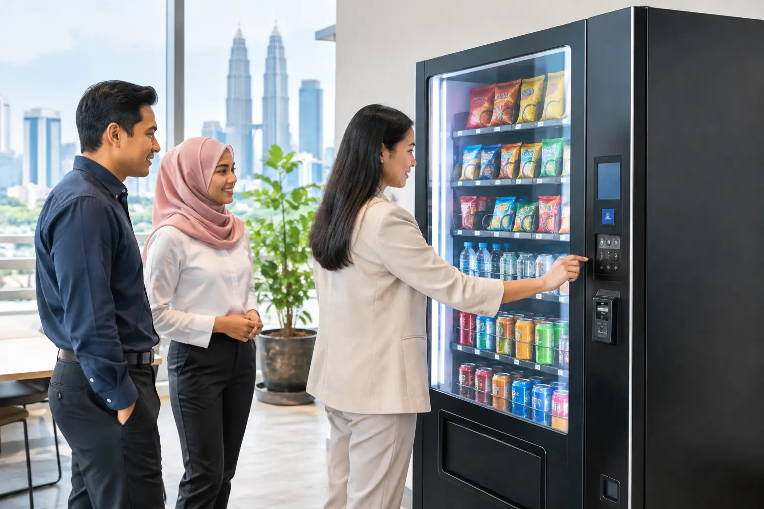
A custom vending design guide should begin with a commercial question, not a colour choice: what will this machine sell, who will use it, and why will they choose it over nearby alternatives? A branded vending machine can create a valuable self-service sales point, but only when its appearance, product capacity, payment options and site conditions work together.
For a gym, that may mean chilled protein drinks, healthy snacks and cashless payment at all hours. For a shopping mall, it could mean a highly visible branded machine with a touchscreen and a carefully selected product range. For an office or factory, dependable daily availability and simple replenishment may matter more than an elaborate exterior. Good design supports the business model first, then makes the machine recognisable and easy to use.
Start with the location and customer behaviour
The best custom machine for a hotel lobby may be the wrong choice for a university, clinic or transport hub. Before choosing decals, screen content or machine size, assess how people move through the site. Look at footfall, dwell time, peak trading hours, nearby food and drink choices, lighting, access for restocking and the availability of power and internet coverage.
A fast-moving location benefits from a clear product offer and quick payment flow. People catching a lift, finishing a workout or waiting for a ride do not want to study a complicated menu. A machine in a lounge, co-working space or specialist retail setting can support more choice, higher-value items and richer on-screen product information.
Placement also affects profitability. A machine hidden behind a pillar, facing the wrong direction or located where people do not naturally pause will struggle, even with attractive branding. Position it where the front is visible from a distance and where customers can stand comfortably without blocking a corridor or entrance.
Choose the machine around the product, not the other way round
Customisation starts with the right equipment category. Snacks and canned or bottled beverages suit standard spiral or chilled machines. Fresh meals and healthy food require reliable temperature control and a replenishment routine that protects quality. Frozen products need purpose-built frozen vending equipment, while coffee, hot food and book vending machines each have very different design and operational requirements.
Product dimensions are especially important. A local beverage bottle, meal box or retail pack that does not fit the selected tray can lead to jams, poor product presentation or failed vends. Provide sample products early in the planning stage so the machine configuration, coil size, shelf layout and delivery system can be matched properly.
There is always a trade-off between variety and capacity. Offering too many stock-keeping units can make a machine look interesting, but low-selling lines tie up space and working capital. In a new location, begin with a focused range based on likely demand. Sales data can then guide changes to the product mix, price points and shelf allocation.
Build a product offer people understand immediately
The strongest vending concepts are easy to explain in one sentence. A corporate pantry machine may offer affordable drinks and snacks for staff. A beauty retailer’s machine may sell travel-size essentials. A café’s after-hours machine may extend sales of ready-to-eat items once the counter has closed.
This clarity should be visible on the machine itself. If the main offer is healthy food, show appetising product images and simple category cues rather than covering every panel with general brand messaging. If a machine sells premium goods, its exterior, lighting and screen content should reinforce that value. The design should create confidence, not confusion.
Make branding visible without making the machine busy
A custom wrap gives a vending machine a much stronger presence than a standard cabinet. It can carry a company logo, campaign visuals, product photography, key messages and contact details. However, the whole machine does not need to become an advertising board.
Keep the brand mark easy to spot from several metres away. Use high-contrast colours that remain readable under indoor lighting and avoid placing essential information over vents, payment modules, collection bays or operational labels. Product windows should remain clear enough for customers to see what they are buying.
Consider the environment too. A bright, youth-focused design may suit a campus or gaming venue, while a corporate office, hotel or healthcare setting may need a cleaner and more restrained finish. The aim is not simply to make the cabinet look different. It is to make it feel appropriate to the location and trustworthy to the buyer.
Touchscreen content should follow the same principle. Use a simple home screen, clear prices, readable product names and a direct route to payment. Screens can carry promotions, nutrition details, bundle offers or rotating campaign messages, but customers should never have to search for the basic buying steps.
Design payment for the way customers actually pay
Cashless payment is no longer an optional extra in many commercial locations. Card, contactless and mobile payment support can reduce friction, shorten queues and make a machine accessible to customers who do not carry cash. For a branded campaign or premium product offer, cashless payment also supports a more modern retail experience.
That said, payment configuration should reflect the site. Some locations still benefit from cash acceptance, particularly where the customer base expects it. Others may be better served by a cashless-first setup that reduces cash handling and simplifies daily operations. The right choice depends on local customer habits, product prices and the operator’s process for collections and reconciliation.
A clear payment area matters as much as the payment technology. Customers should be able to see where to tap, insert or scan without obscuring the screen or collection door. If a payment fails, the machine interface should give understandable guidance rather than leaving the customer uncertain about whether they have been charged.
Plan the operational details before installation
A profitable vending machine is not passive in the sense of being forgotten. It needs a practical operating plan for restocking, cleaning, temperature checks where relevant, expiry control, cash management where relevant and technical response. Custom design should make these tasks easier, not harder.
Leave access to service doors, cooling systems and payment components unobstructed. Choose durable materials for high-touch areas, especially in busy public locations. If branded panels may need updating for seasonal promotions or a new product range, discuss whether replaceable graphics are more suitable than a permanent full wrap.
Remote monitoring can be particularly useful for operators managing more than one site. It helps track stock levels, machine status and sales patterns, allowing replenishment to be planned around real demand. This reduces unnecessary journeys while helping prevent empty selections at peak periods. It also provides the information needed to decide whether a location deserves more capacity, a different product mix or a different machine type.
Budget for support, not only the cabinet
The purchase price is only one part of the investment. A lower-cost machine without accessible spare parts, warranty coverage or responsive repair support can become expensive when it is out of service. Downtime means missed sales, frustrated customers and potential damage to the brand displayed on the cabinet.
Ask a supplier how maintenance requests are handled, what spare parts are available locally, what warranty terms apply and whether help is available after installation. For first-time operators, guidance on site selection, product suitability and payment setup can be as valuable as the physical machine. KCH Vending supports businesses with equipment selection, custom branding, installation guidance and after-sales technical care, helping turn a machine purchase into an operating retail point.
Test performance and improve with evidence
Once the machine is live, treat the first few months as a learning period. Monitor which products sell, when sales occur, which payment methods customers use and whether certain selections experience repeated issues. A beautiful machine that sells the wrong products is not a successful design.
Small changes can have a meaningful effect. Moving bestsellers to eye level, reducing slow-moving choices, adjusting prices, adding a seasonal line or updating the screen promotion can improve results without replacing the machine. If footfall is strong but conversion is weak, review visibility, product relevance and payment ease before assuming the location has failed.
A custom vending machine works best when it is designed as a practical retail channel rather than a decorated appliance. Choose equipment that suits the stock, create branding that gives customers confidence, and put reliable support behind the operation. The result is a self-service point that can keep trading long after the surrounding counter has closed.